

Does Microsoft PowerPoint have an org chart?
Microsoft PowerPoint is a pervasive presentation application.
Approximately 35 million PowerPoint presentations are given each day by an estimated 500 million users worldwide.
– Polls Everywhere
PowerPoint is often used for organization charts. It is important to distinguish making an org chart with PowerPoint from presenting an org chart with PowerPoint. PowerPoint can make an org chart and then present the results, even when PowerPoint might be a bad choice for the task.
Make an org chart in PowerPoint
To make an organization chart in Microsoft PowerPoint, use the SmartArt feature. The details behind these steps are available for creating an org chart in PowerPoint.
Step 1. Add a new blank slide
A blank slide will give us more room on the slide for a larger org chart. You can, however, use any chart layout.
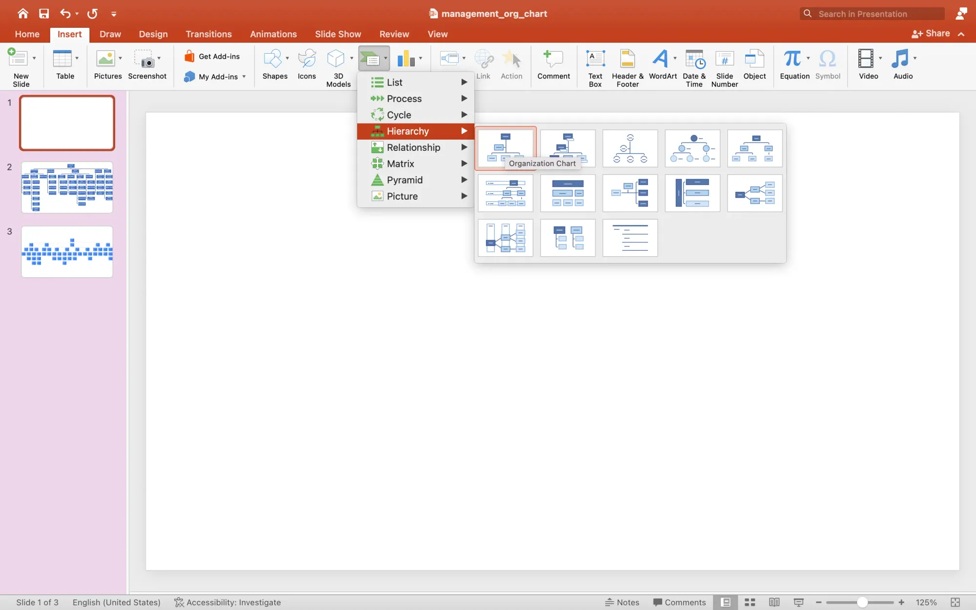
Step 2. Add hierarchy SmartArt
To create an organization chart choose the Insert menu, then find the SmartArt button on the toolbar. Choose the hierarchy option. There are several hierarchy designs in PowerPoint. These are functionally the same, they differ in appearance.
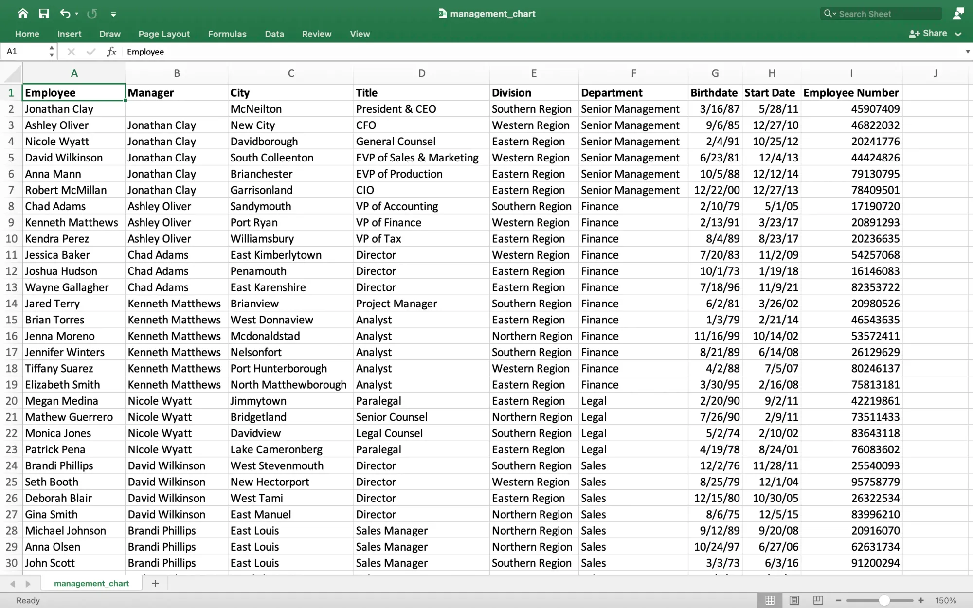
Step 3. Display Excel employee data alongside PowerPoint
When your employee data is in a spreadsheet, Microsoft Excel or Google Sheets, it is best to keep it visible to navigate between the spreadsheet and the presentation quickly.
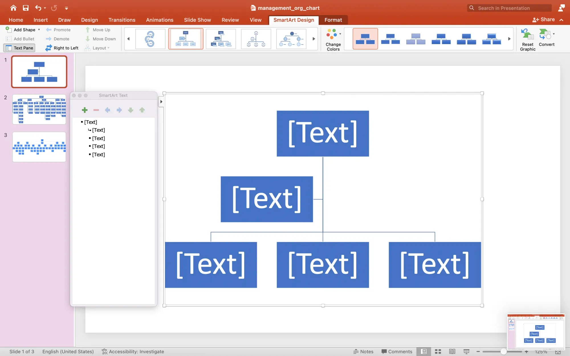
Step 4. Use the SmartArt outline panel to add employee names
PowerPoint has a panel which helps to add data to SmartArt. Use the outline view to copy employee names from your spreadsheet into the SmartArt.
The outline panel will build the structure for your org chart. Indented sections become branches in the chart.
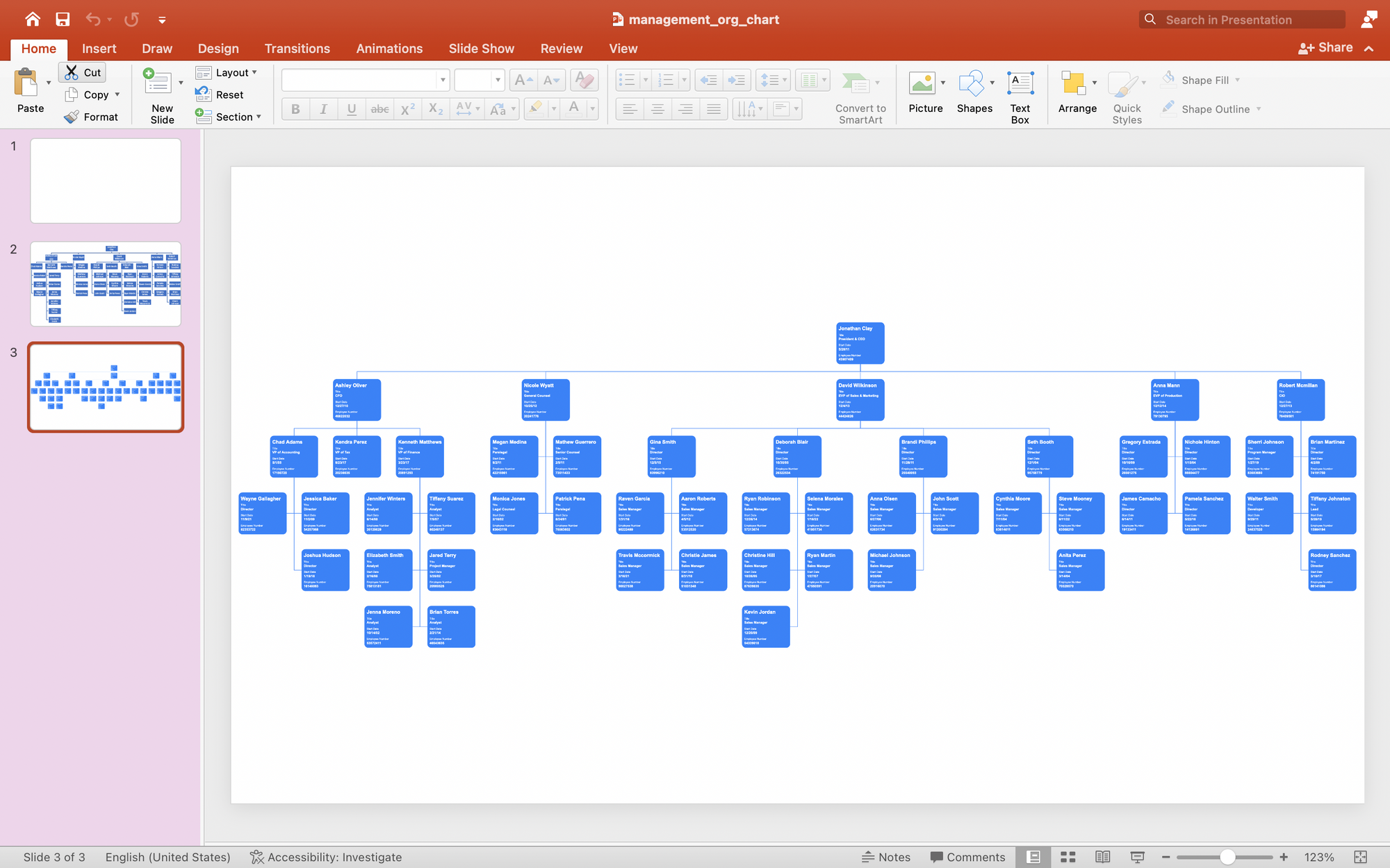
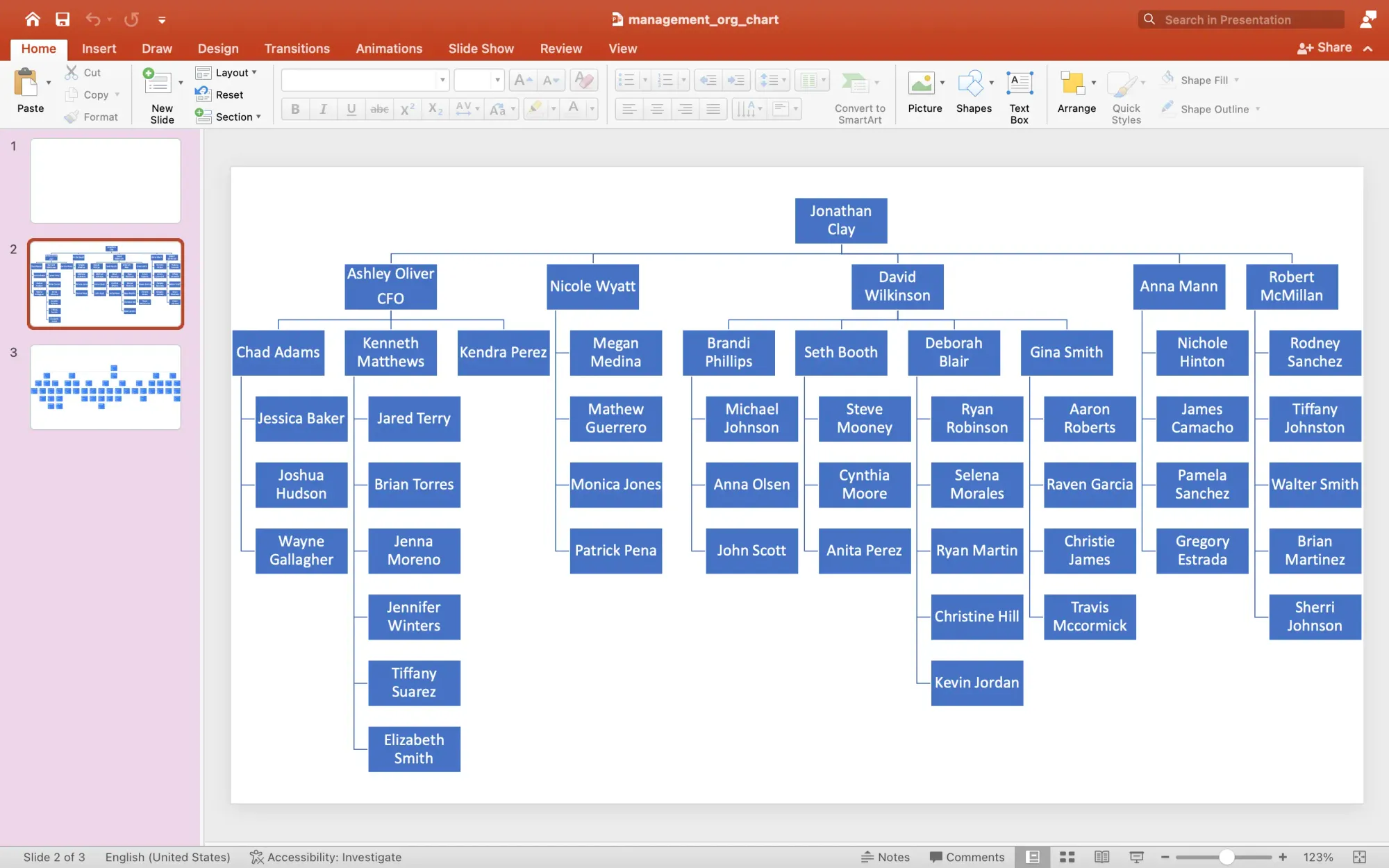
Copy and paste the employees directly under the manager to whom they report. PowerPoint redraws the organization chart as you add more data. It will help your chart by reducing the font and card size to accommodate more employees and managers. PowerPoint optimizes the structure to keep the chart from becoming wider than necessary.
The result is adequate but not great. The layout is cramped and none of the employee data from Excel is displayed.
3 reasons NOT to make an org chart in PowerPoint
1. PowerPoint means manual data entry
Org charts in PowerPoint are not automatic or data-driven. This means that you must type every word on the chart. The chart has limited ability to create a hierarchy for you. True, SmartArt will add boxes and branches, but it does not understand the relationship between boxes. You also cannot use a spreadsheet of employees or companies to generate an org chart.
2. PowerPoint requires a fixed canvas
Presentation applications like PowerPoint use a fixed canvas. To get an organization chart to fit the canvas requires you to push, pull, resize, collapse, and contort the chart to fit.
This space makes only simplistic charts visible. Large, realistic charts are either reduced to the point of illegibility or cut across multiple slides, losing the benefit of a comprehensive view.
3. PowerPoint has no AI layout support
PowerPoint uses a crude layout feature which does not support realistic layouts. PowerPoint does not have artificial intelligence to evaluate your employee or company data to create an org chart in seconds.
Present an org chart with PowerPoint
How to present org charts with PowerPoint, if you must
There are two reasons not to use PowerPoint to show or distribution an org chart:
- No one likes, wants, or cares about a PowerPoint presentation. See PowerPoint is Evil, PowerPoint is Evil, Redux, and the science behind why PowerPoint is so bad, just for starters.
- The fixed canvas prevents you from communicating all but the most simplistic organization structure. If you have more than 7 boxes, forget PowerPoint as a practical matter. Yes, you can shrink it to fit, but should you?
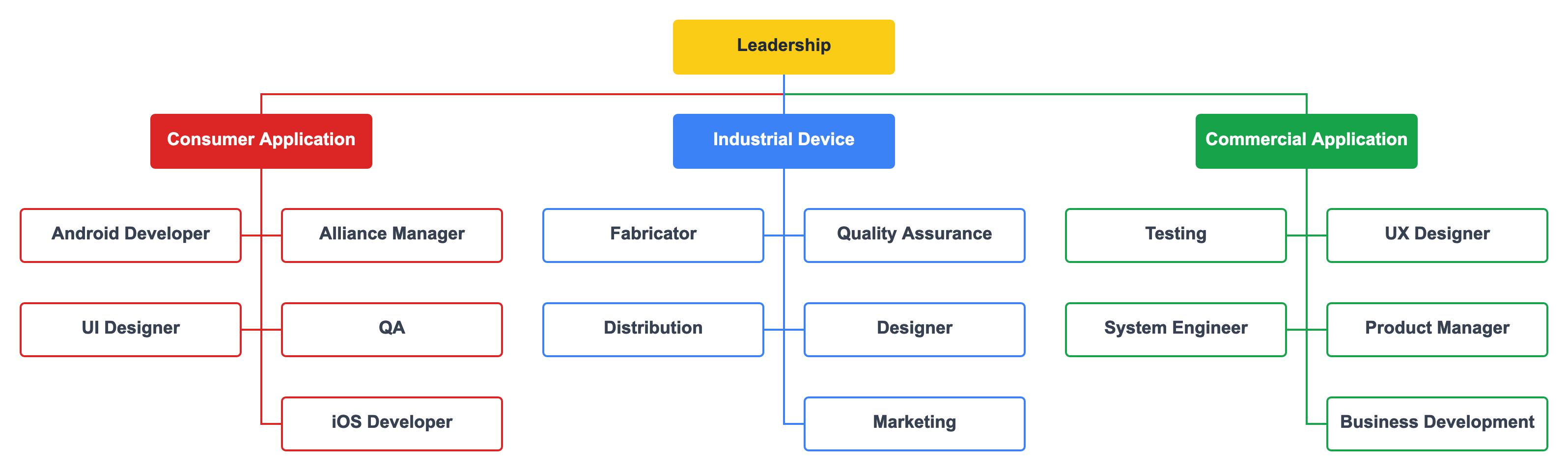
If you must use PowerPoint, the best option is to embed an image of the organization chart from the org chart software you used that links to a dynamic viewer for your presentation.
Here is an example of an embedded org chart.

The best way to present org charts to your audience
If you know the data behind people's hatred of PowerPoint, then you will seek alternatives. Here are two profoundly easy options, once you create your organization chart with actual org chart software.
To communicate the organization structure not in a presentation, download the chart at whatever size it is and send it to your audience. You do not need to embed, alter, or fold your chart into a paper airplane to send. If the chart is large, download it in the natural size. Your audience will open the file and see the chart in all its glory.
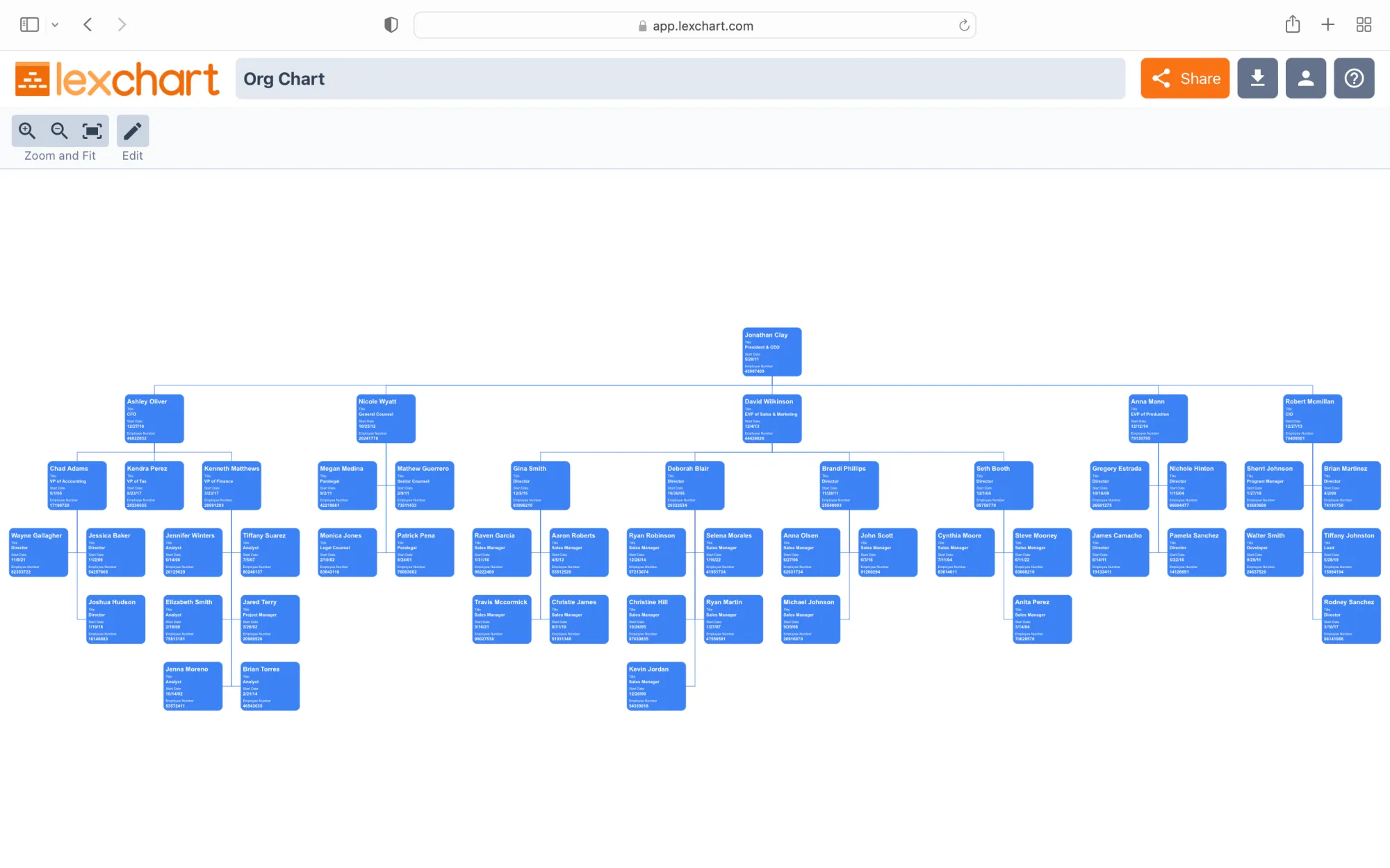
To communicate the organization structure during a presentation, use a dynamic view in your org chart software. The Viewer allows you to pan and zoom on an infinite canvas to explore a large chart. This means that your chart can be gargantuan and your audience can see the entire chart on one canvas.
PowerPoint is not going anywhere. Someone probably asked you "make an org chart in PowerPoint." When you search for "How to create an org chart PowerPoint", consider "Should I create an org chart in PowerPoint" or "Alternatives to creating an org chart in PowerPoint".
As an alternative, consider Lexchart which uses artificial intelligence to find and present the best layout of your organization chart.